Mokum Productions
Branding
Mokum Productions
Branding
Client
MOKUM PRODUCTIONS
Release date
JAN. 2018
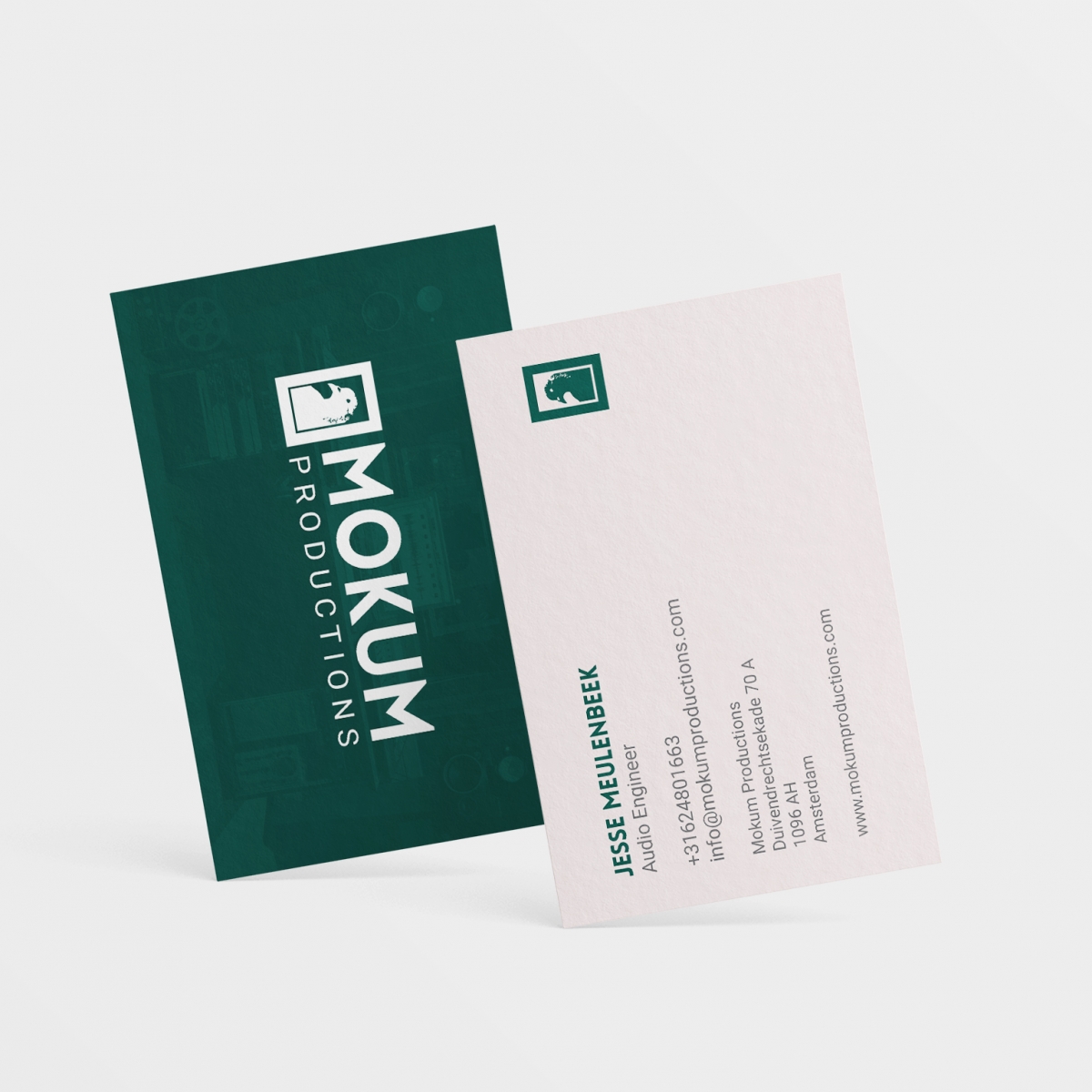
Mokum Productions is a startup music studio located in the Overamstel district of Amsterdam. While the founders of the studio where building and handling the interior decoration of the location, the Residue Design team helped them create a professional branding image. Defining what the brand stands for and wishes to communicate to its customers and potential clientele was of utmost importance when creating the proper branding message and style for the company. Together we created the proper foundation for the brand and website.
The word Mokum, or “place,” is Amsterdam’s version of New York’s Big Apple — a nickname indistinguishable from the city it romanticizes. Amsterdam’s most iconic location, Dam’s Square, is well known to have a large pigeon population, motivating the client to request the bird being integrated into the company’s logo. Delivering the message of being a local music studio that’s proud of its city was important to the two Amsterdam native founders of the company, and quickly integrated into the design. An Art Deco style font reminiscent of the old ‘Amsterdamse School’ Architecture was carefully blended to create an indistinguishable brand the client is proud to represent. The dark Casino Green color is also integrated into the interior of the studio and is a recognizable returning theme of the brand. The new branding has been implemented to create business cards, a website, clothing, signs and other physical and digital products.


